
The Cupcake Store
Simplifying online cupcake ordering while keeping the brand playful
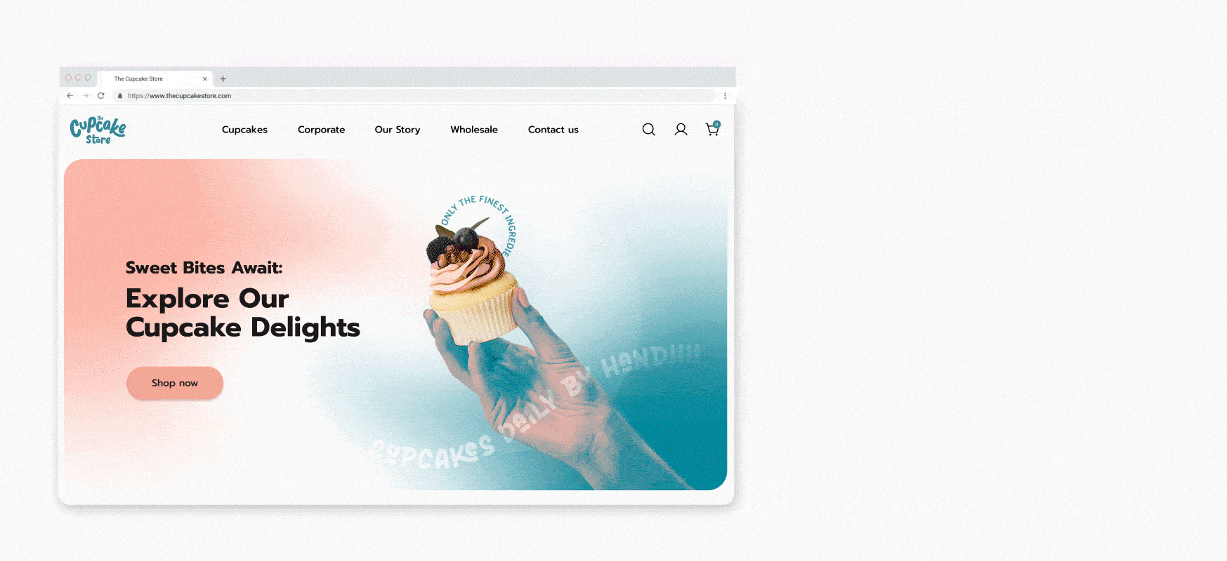
This case study explores The Cupcake Store, a Dublin-based business that grew from a local farmers’ market stall into an online platform for custom and themed cupcakes, with a focus on improving design and user experience
ROLE UX / UI Designer
DURATION 8 weeks (2024)
METHODS User research, Wireframes, Prototyping, and Visual design.
TOOLS Figma, Google Form, Adobe Illustrator, Photoshop and After Effects.
CHALLENGE
Busy customers struggled to find, customize, and order cupcakes online due to poor website usability.
The original website had several usability issues:
Confusing navigation and unclear product categories
Poor visual hierarchy and inconsistent UI
Lack of clear user flow for ordering cupcakes online
Difficulty for first-time users to find information or complete a purchase
GOAL: Redesign to simplify navigation, clarify product browsing, and improve the ordering experience.

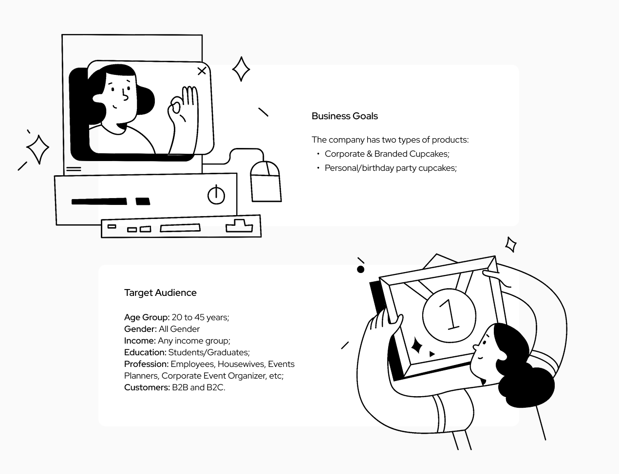
Founded in 2008 by pastry chef Patricia Kelly, The Cupcake Store began as a small farmers’ market stall in Dublin. It has since expanded to multiple markets and an online platform, specializing in custom, corporate, and branded cupcakes. The bakery is known for high-quality products at competitive prices and serves a wide range of personal and corporate clients.
Research & Insights
1. Heuristic Evaluation
I started with a heuristic review to identify usability problems like:
Poor visibility of system status (users unsure where they are in the flow).
Inconsistent elements and missing standards.
Lack of error prevention warning messages.
These insights made it clear that both navigation and visual hierarchy needed improvement to reduce friction.
2. Desk Research & Competitive Analysis
I compared competitors in online dessert and bakery shops to understand UX, displaying product categories, cart flows, and customization features.
Noted common practices for product filtering, checkout flows, and responsive design.
This helped establish baseline expectations for structure and visual design.
Key Insight:
Users want a fast, intuitive way to find and order cupcakes without confusion, while still enjoying the brand’s fun personality.
3. Personas & User Journey
Based on the research, I found the primary persona: Julia, 31, a payroll assistant, enjoys gifting and ordering sweets online
I mapped her journey to identify friction points: discovering products, selecting flavors, customizing, and checking out.
We can observe Julia's journey here.
Key Insight:
From research, the main usability problems were:
Confusing navigation labels and missing pages.
Poor information architecture.
Mixed visual hierarchy and unclear calls to action.
Design Decisions
Design priorities before sketching:
Clarify menus and labels so users can easily find products and checkout.
Organize content into logical categories (standard, themed, and custom cupcakes).
Improve product visibility and hierarchy.
1. Information Architecture & User Flow
I redesigned the information structure to streamline paths from browsing to checkout.
Reorganized the navigation into clear, user-centered categories: Cupcakes, Gifts, Specials, About, Contact.
Created flows for two main scenarios: quick purchase and corporate/custom orders.
This helped reduce cognitive load and made primary tasks easier to complete.
The complete Information Architecture analysis is here.
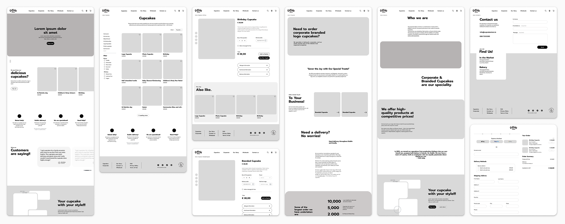
2. Wireframes & Sketches
Low-fidelity wireframes focused on content hierarchy, clear CTAs, and easy navigation
Iterated with simple sketches to explore alternative layouts for product cards and checkout forms.
3. UI Design Choices
Some key UI decisions:
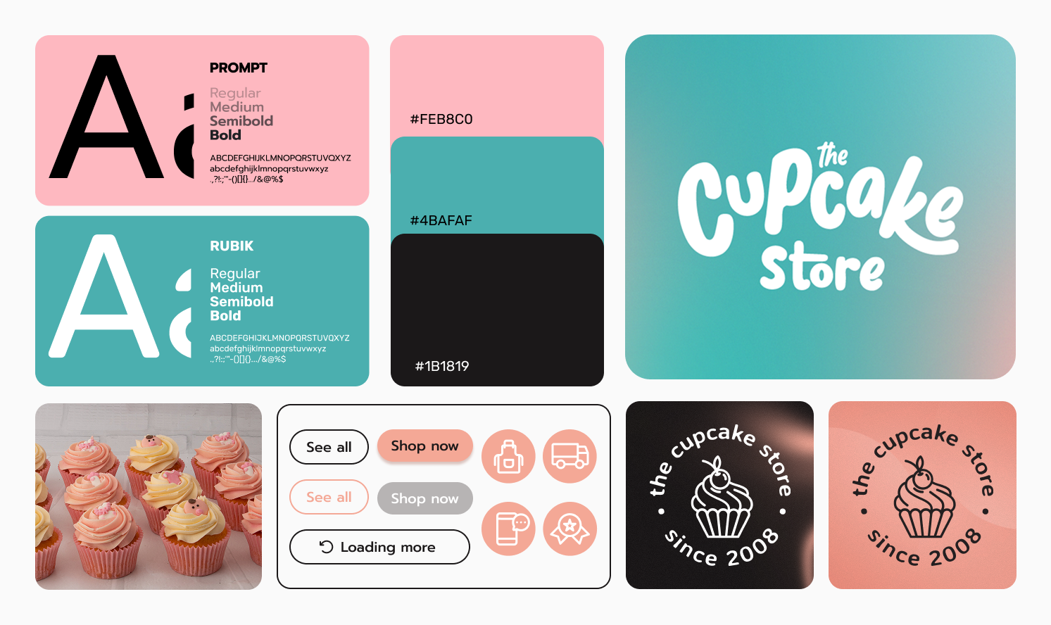
Used brand colors and playful typography to maintain the store’s personality
Introduced visual hierarchy, whitespace, and consistent button styles to improve usability
Optimized product pages with clear images, descriptions, and add-to-cart actions
These choices aimed to reduce friction and support quick decision-making.
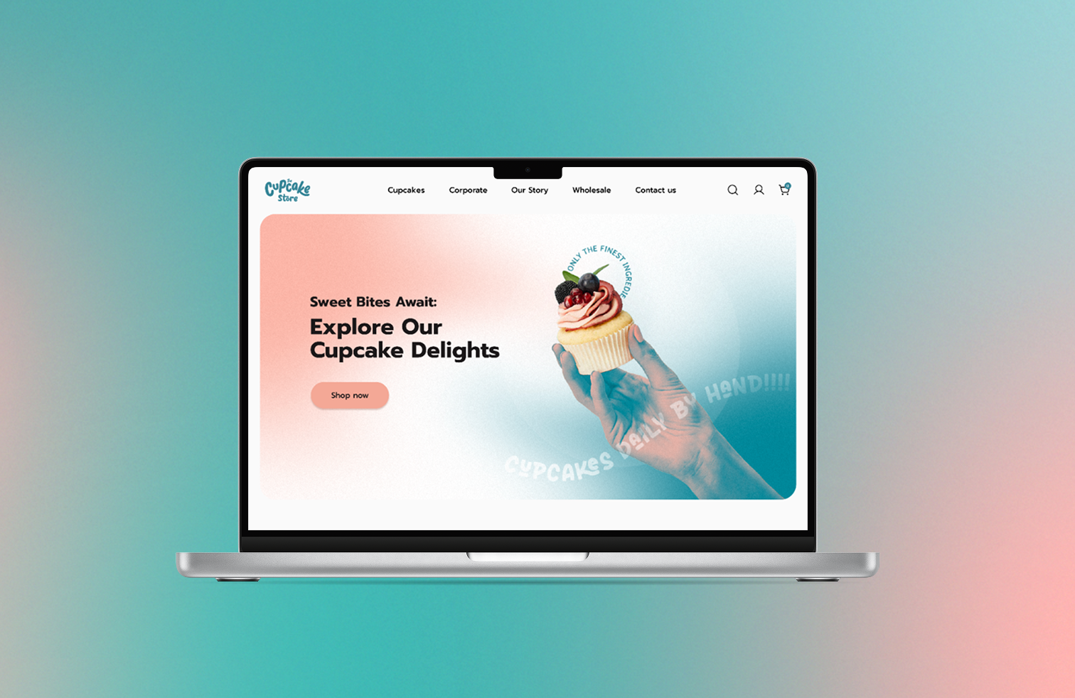
Prototype & Outcome
I developed high-fidelity prototypes showing streamlined product browsing and checkout flows.
The redesign improved clarity, reduced steps in the checkout process, and aligned UI with brand identity.
While full usability testing wasn’t completed within this solo study, the prototype lays a foundation for future testing cycles
Reflection & Takeaways
Simplifying navigation and user flows is crucial, even for playful, visually rich brands
Early heuristic evaluation helps identify major usability issues before prototyping
Iterative wireframing and testing ensure design decisions are user-centered and practical
Learned to balance brand personality with functional usability, a key skill for Junior/Mid UX/UI roles
All research and ideation are available in full here.