The Cupcake Store Rebranding
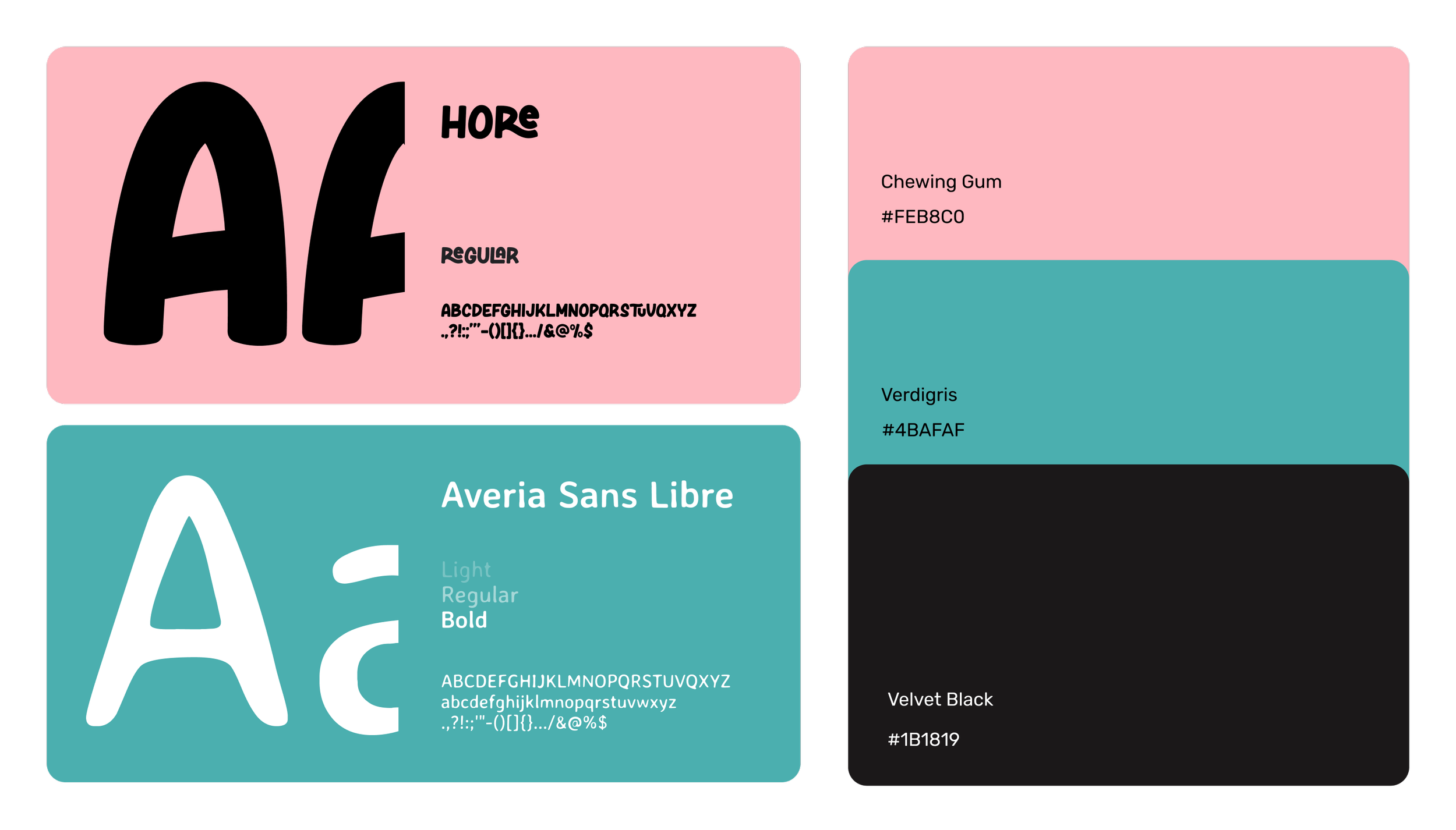
Graphic Design
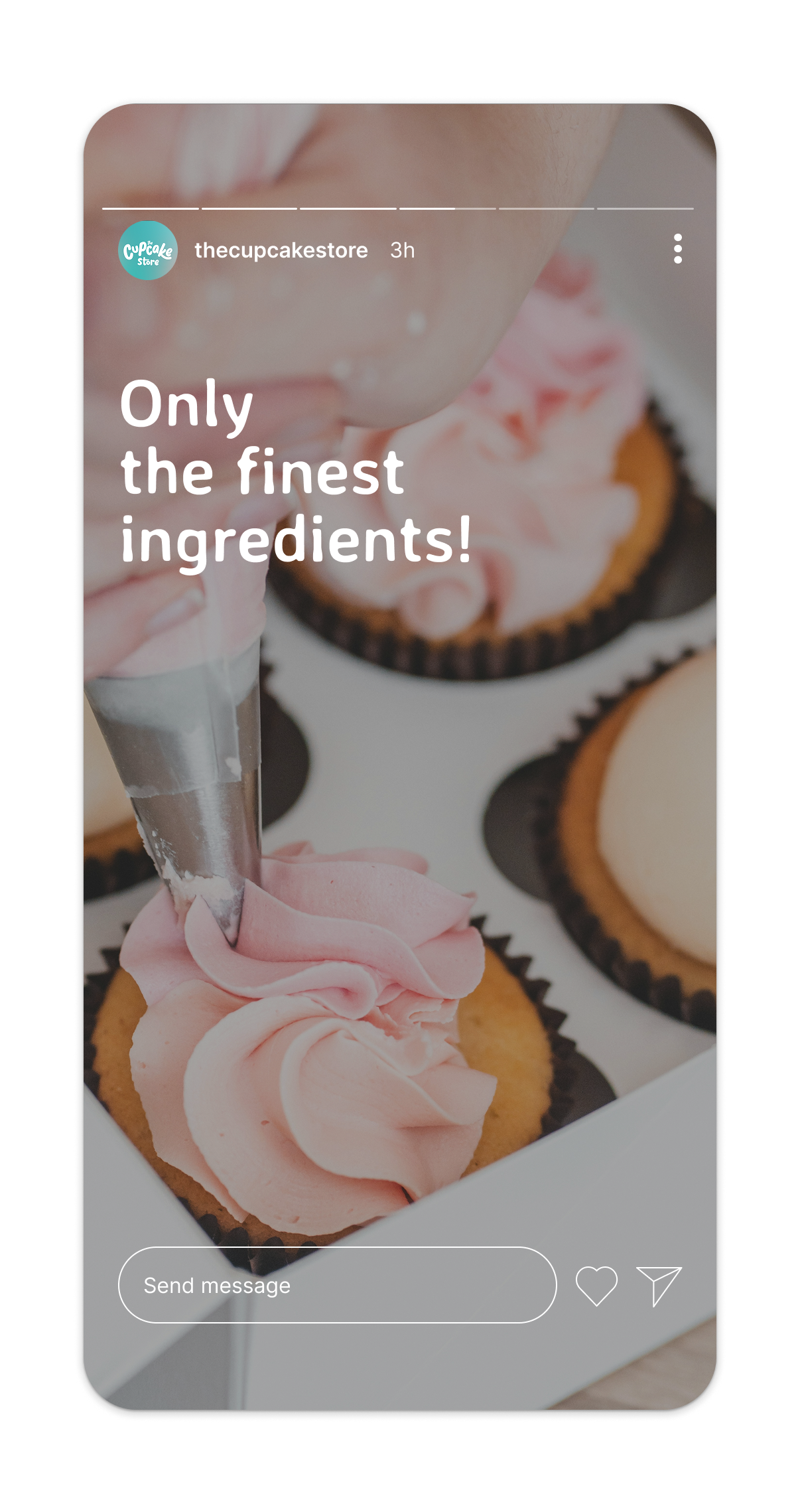
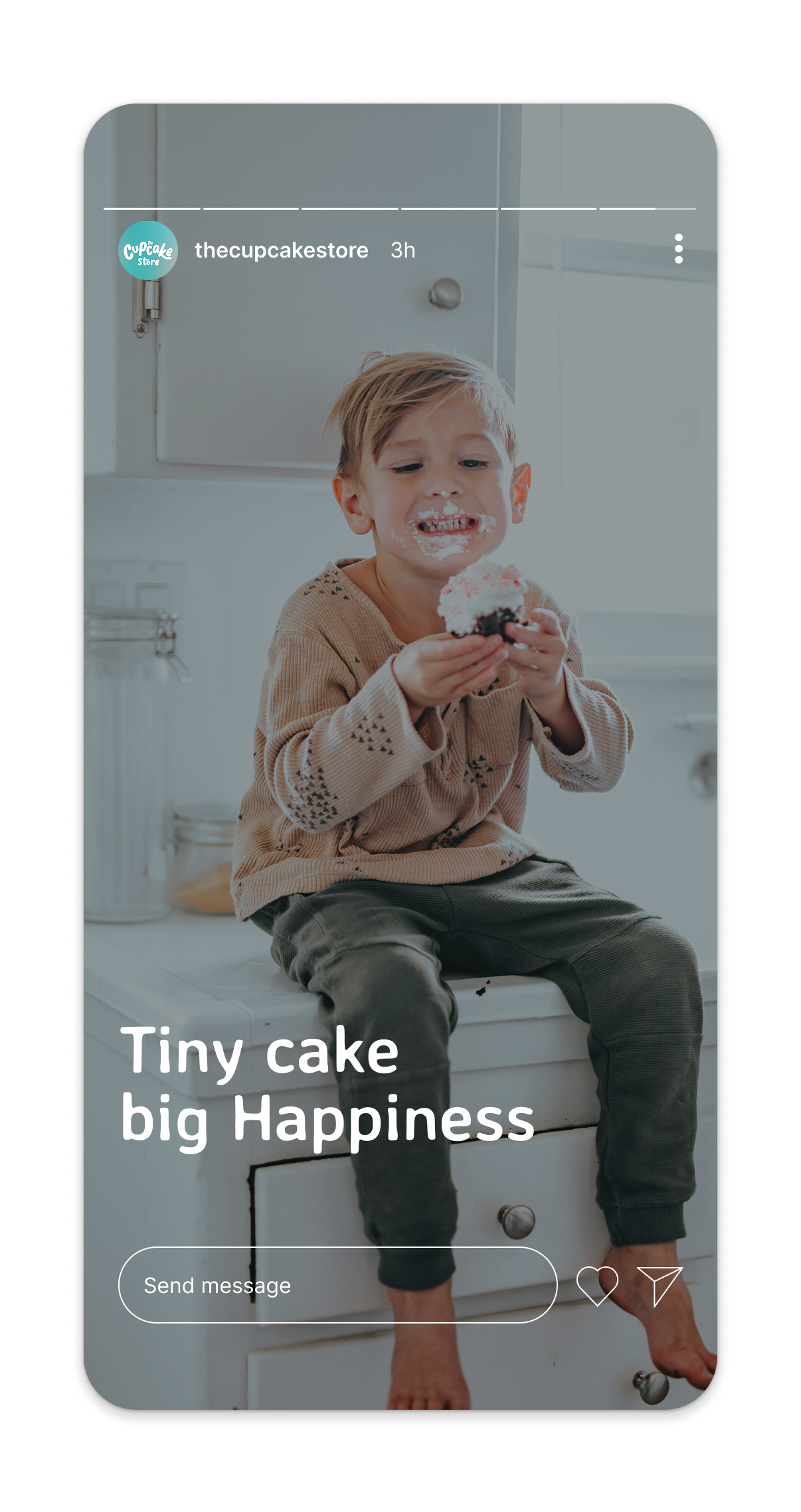
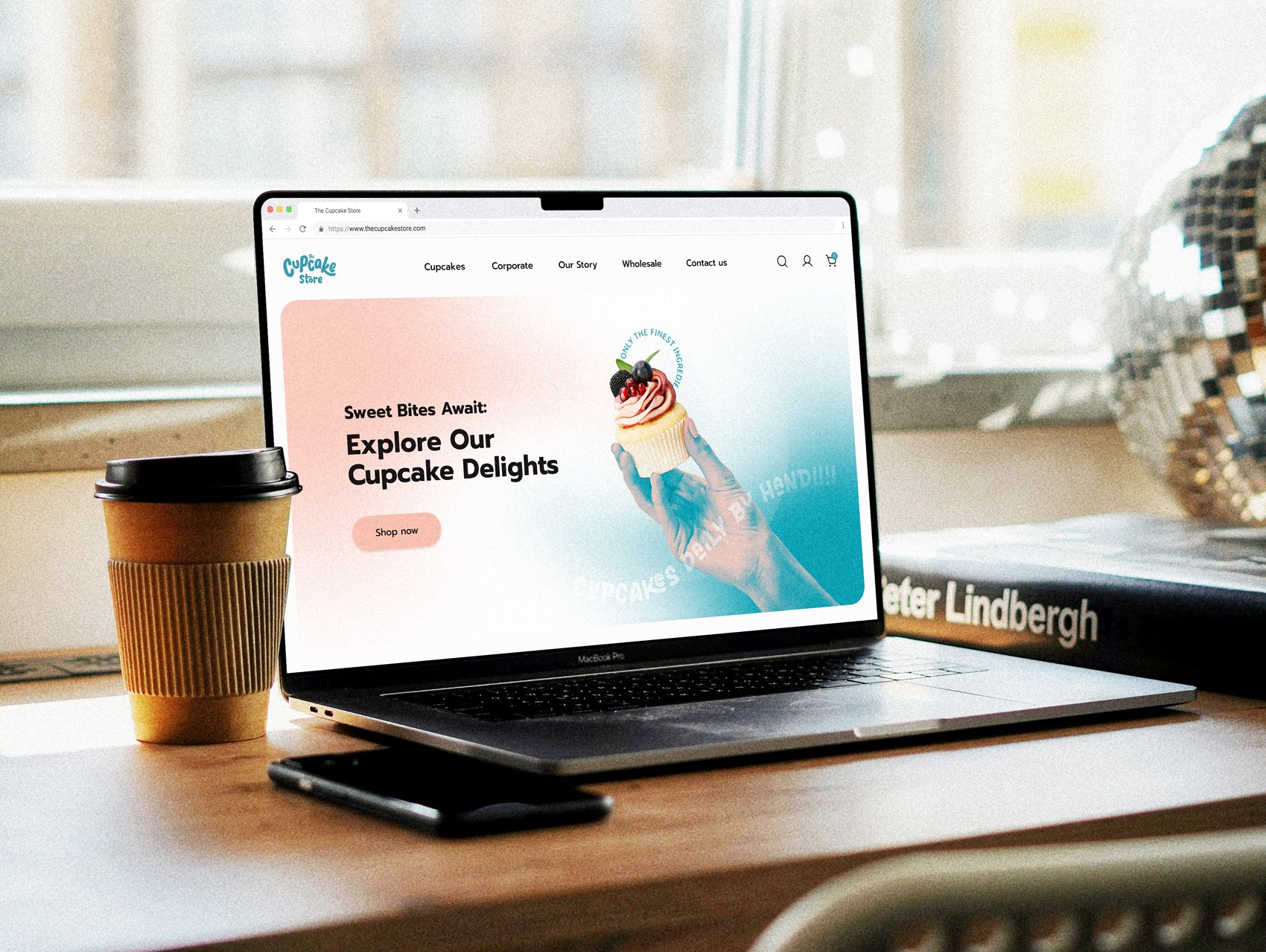
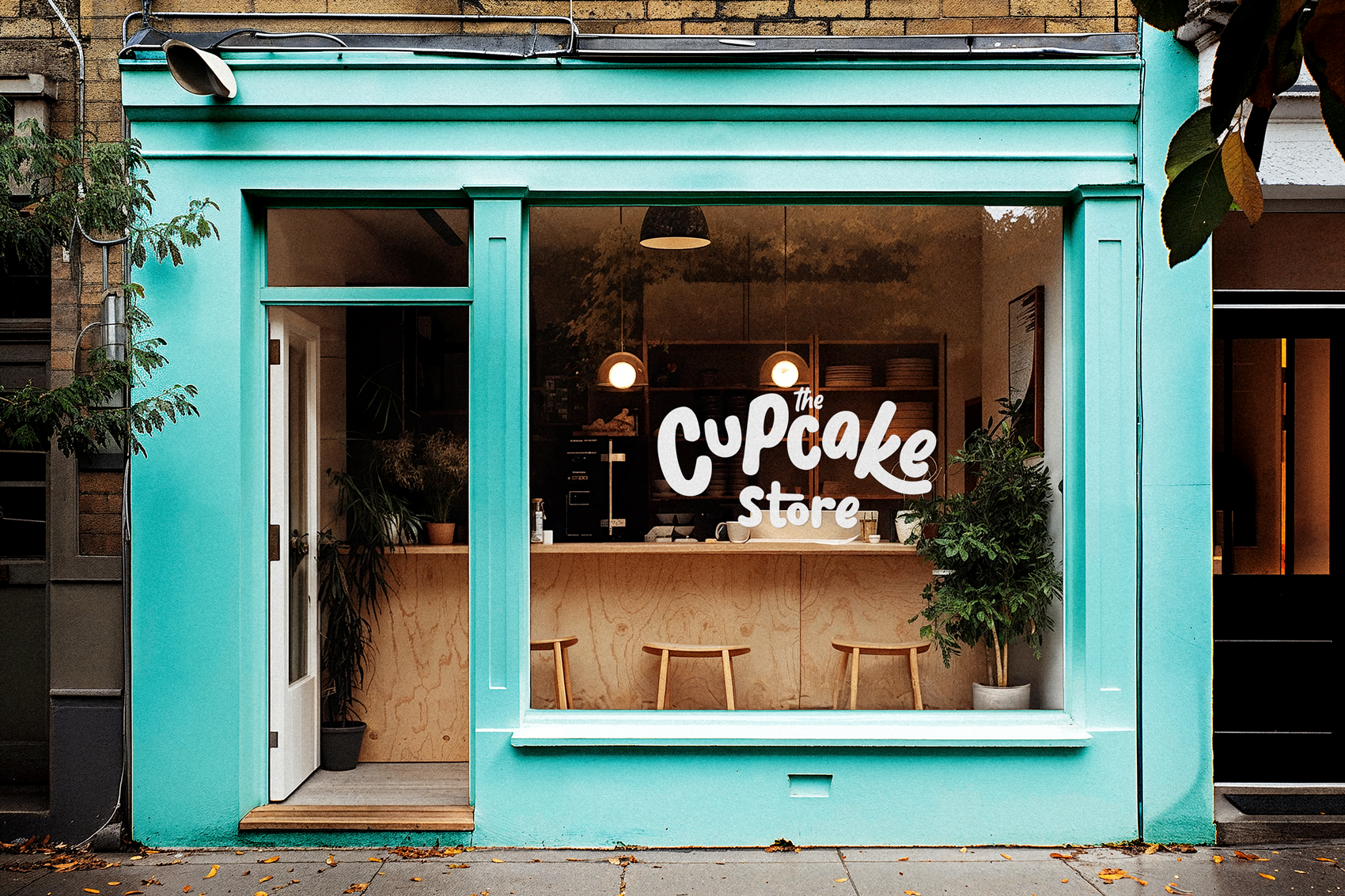
The Cupcake Store is an Irish company based in Dublin that began as a small business at local farmers’ markets and gradually evolved into an online platform specializing in personalized and themed cupcakes. With this natural growth of the business, the need emerged for a visual identity that reflects this maturity and conveys a stronger sense of personality.
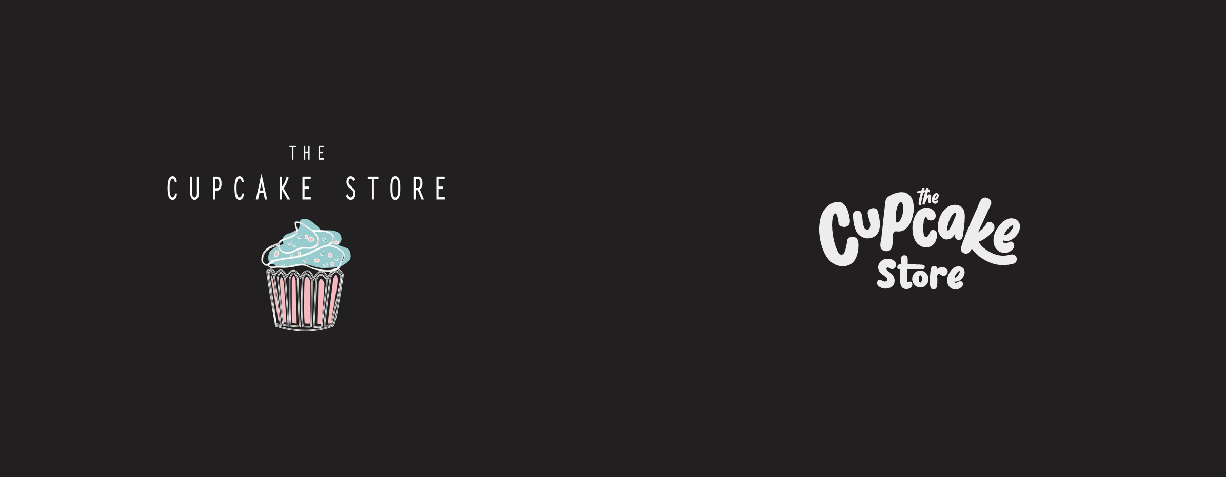
The previous brand used a thin cupcake illustration, delicate typography, and a dark background. Although aligned with the product, the result felt visually fragile, with unbalanced proportions and a generic look for the segment.
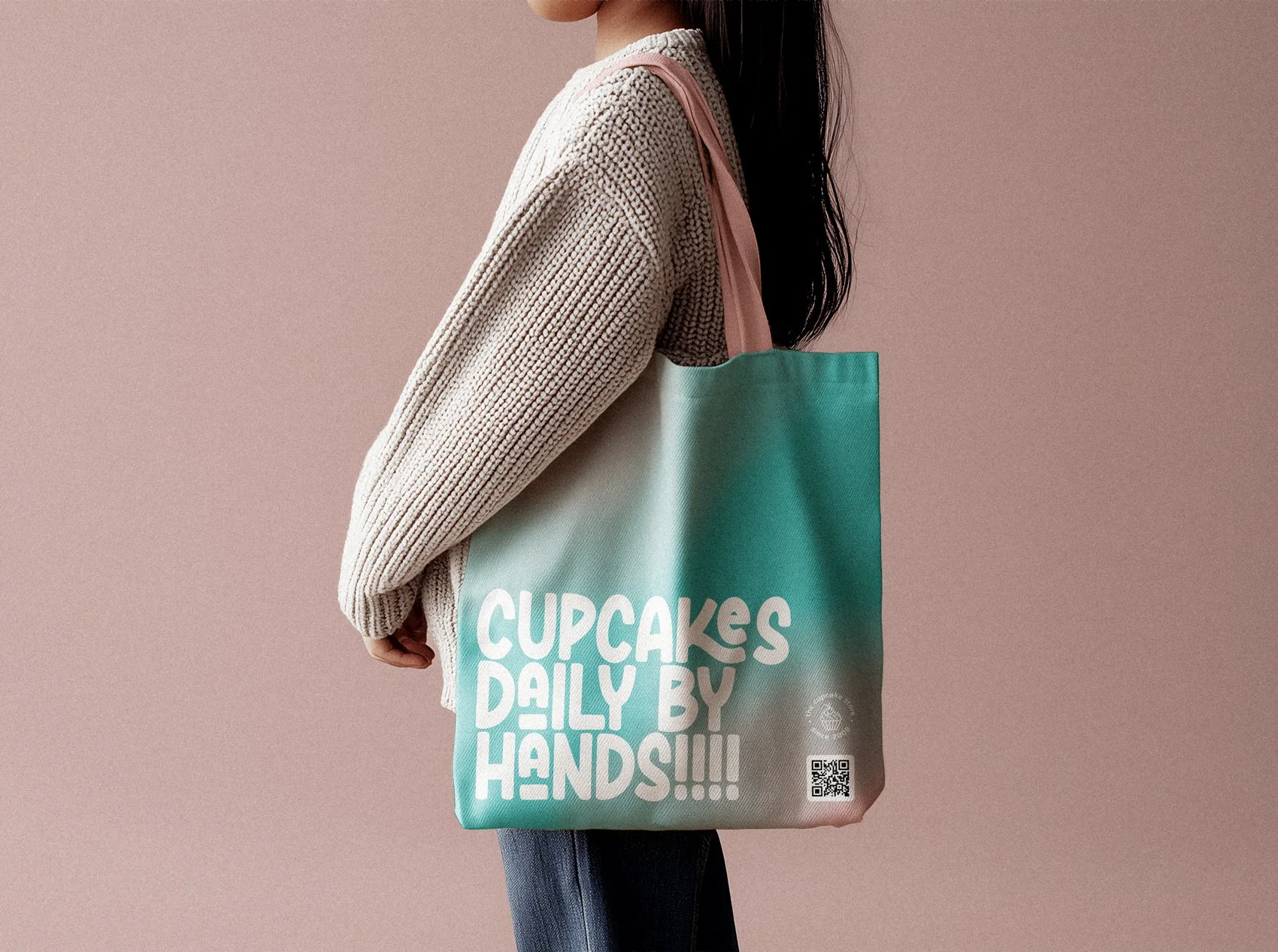
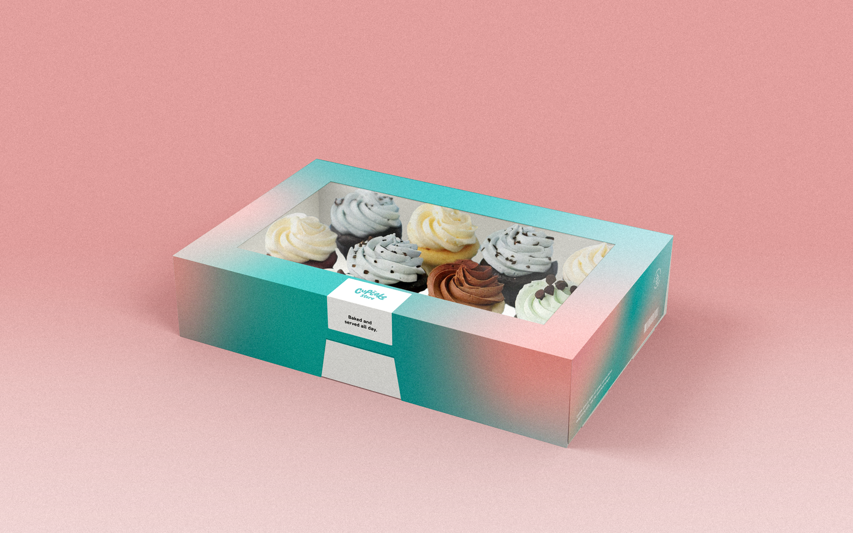
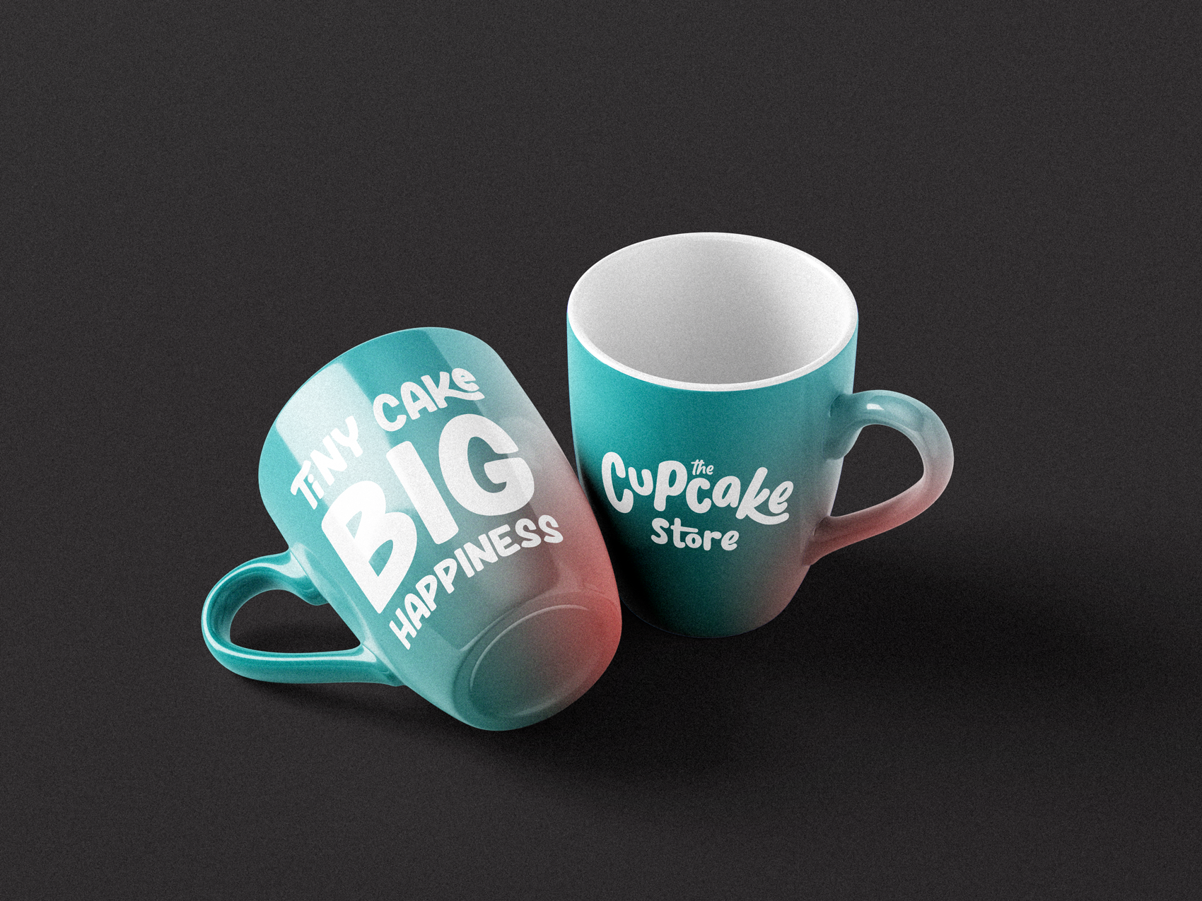
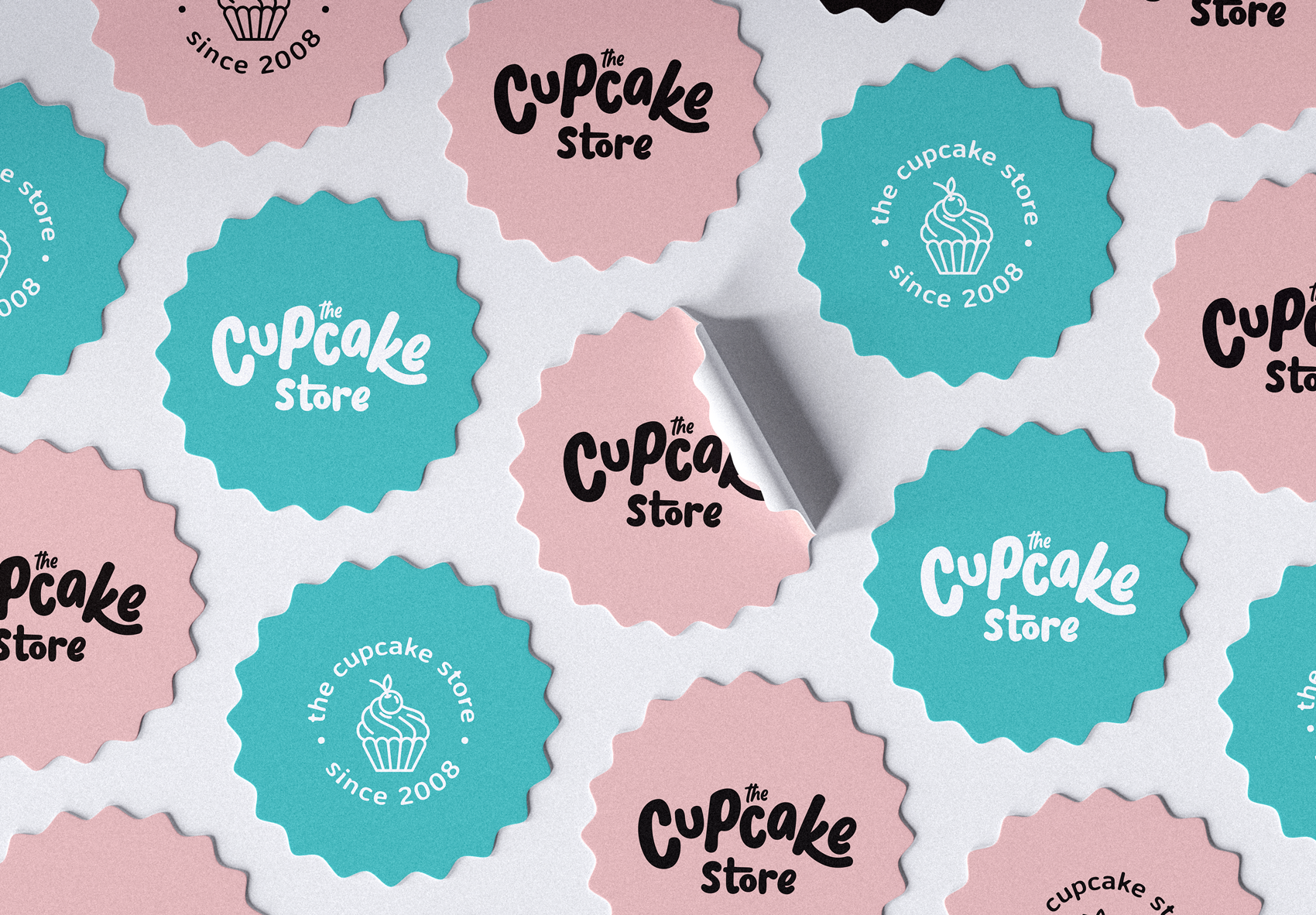
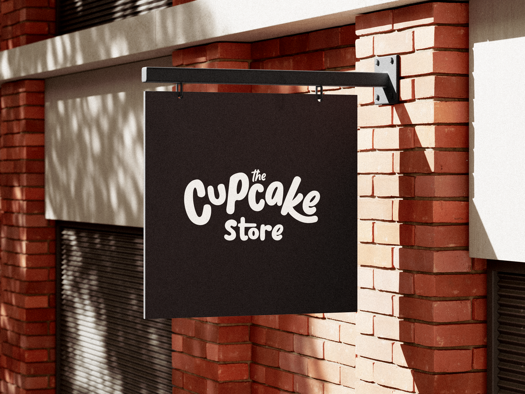
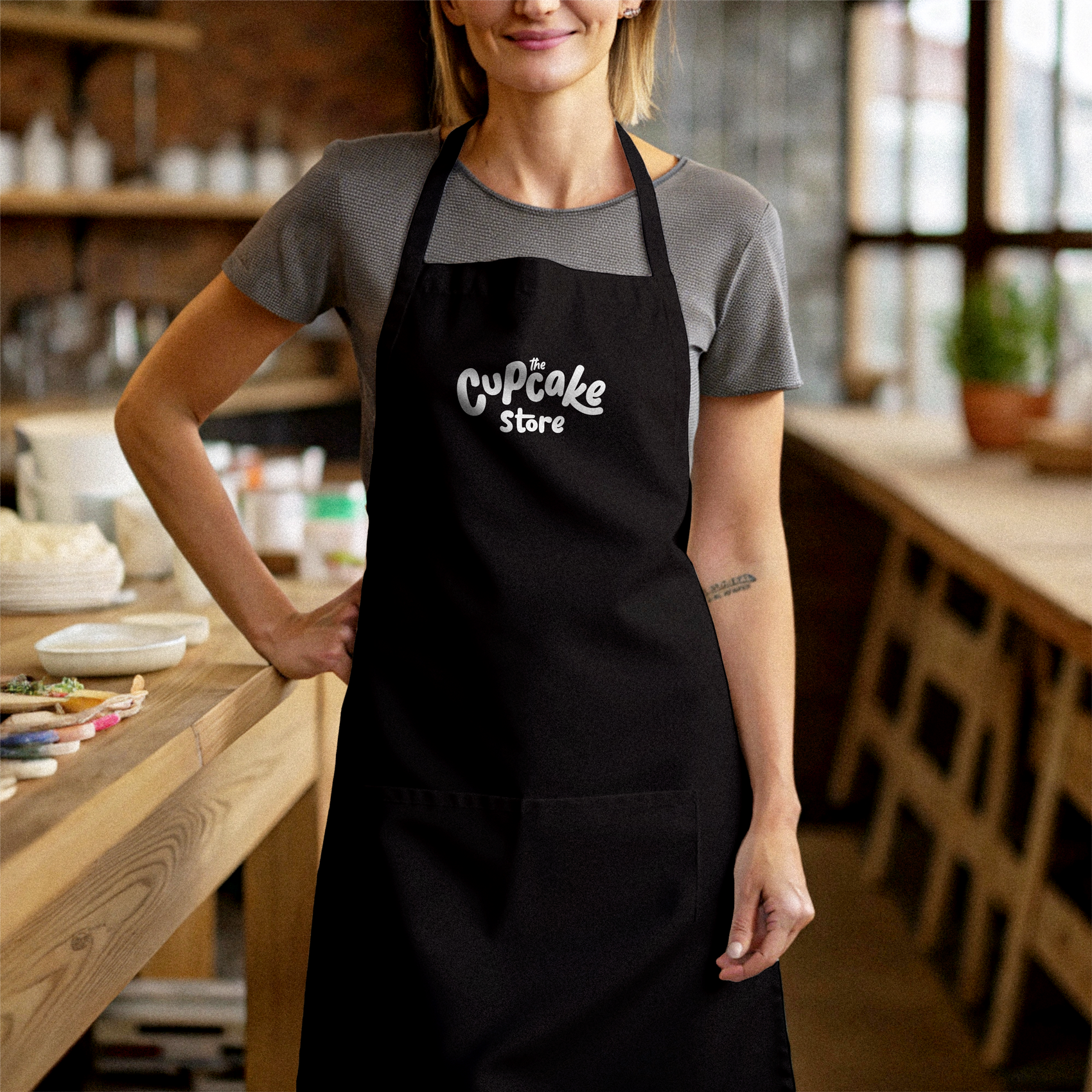
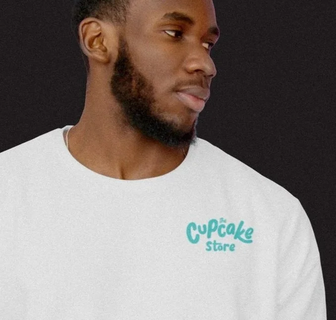
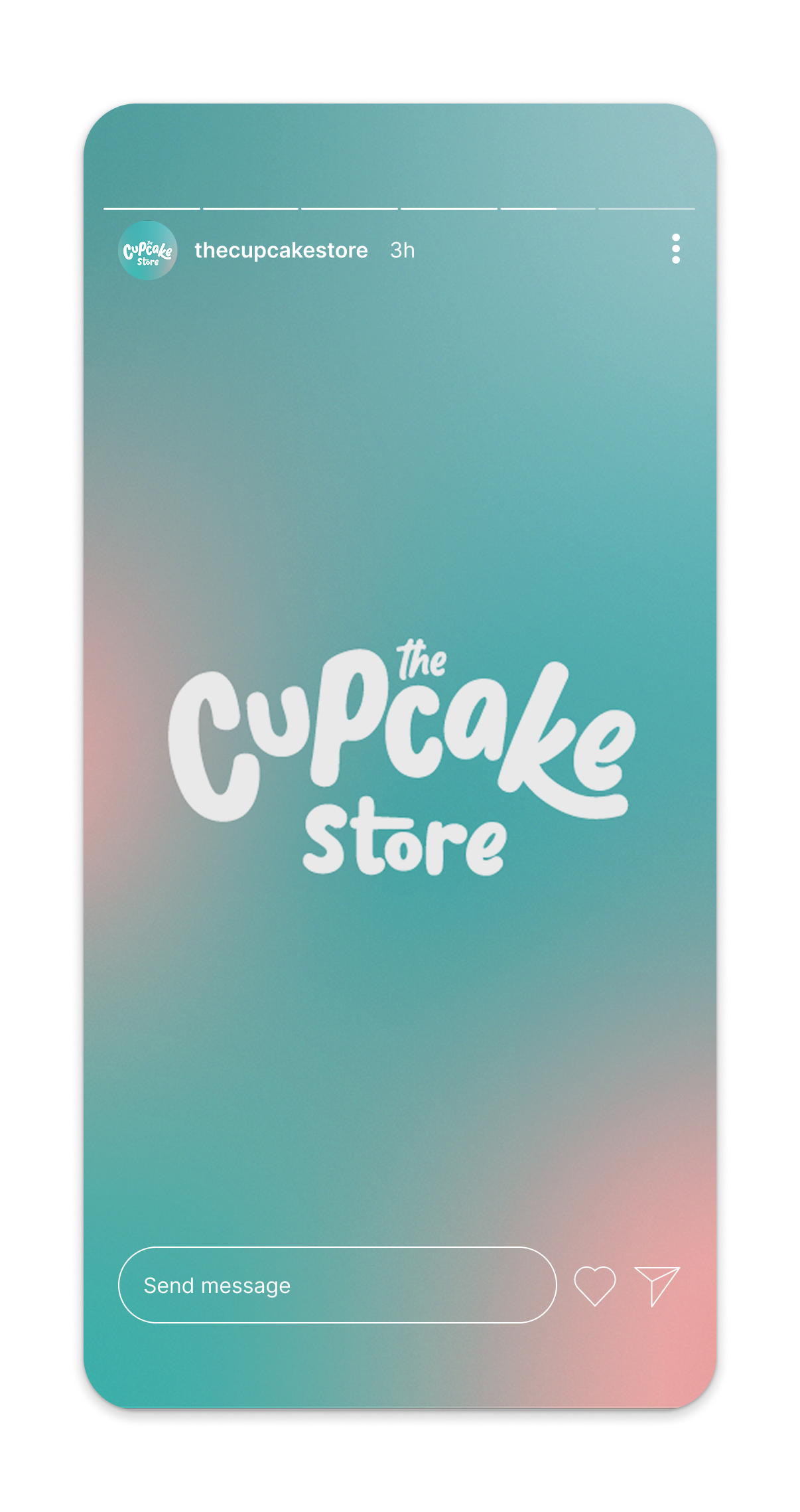
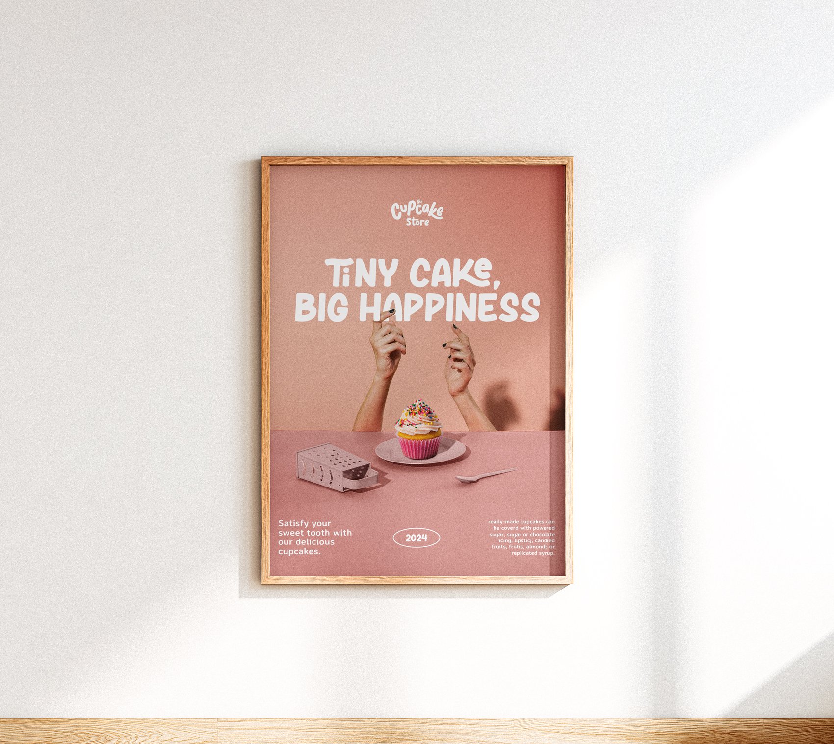
The redesign shifted strategically away from a literal cupcake icon, placing the brand name at the center. The new logotype adopts a playful, fluid handwritten style with custom details that give each letter character.
The hierarchy was refined: “the” appears smaller at the top, “Cupcake” stands out with a slight upward curve, and “Store” anchors the base—subtly suggesting a cupcake silhouette without depicting one directly.
Before
After