
How Many People Fit?
UX/ UI and Graphic Design Challenge
This project is a redesign of a landing page for a five-day email course about safe event capacities. The challenge was to turn complex, technical content into a clear and engaging narrative that encourages event professionals to sign up.
ROLE Research, visual design, wireframing, and prototyping.
DURATION 3 days (2024)
METHODS Dask Research, Wireframes, Prototyping, and Visual design.
TOOLS Figma, Adobe Illustrator, Photoshop
CHALLENGE
How might we present a technical topic, safe event capacity calculations, in a way that feels accessible, credible, and engaging for busy event professionals?
GOAL
Increase engagement and course sign-ups through a clear narrative, better hierarchy, and a more trustworthy visual experience.
Discover & Define
1. Understanding the Context
I started by asking fundamental questions:
What does the company do?
Who is the course for?
What problems does this audience face?
To validate assumptions, I conducted desk research on the company, the industry, and potential users..
Key insights
The company operates in the event safety and planning space, offering education and training.
The course focuses on calculating safe capacities for festivals and events.
User groups identified
Businesses and organizations (B2B)
CEOs, managers, and producers (40–45), formal profiles and decision-makers.Freelance event planners (B2C)
Mostly women (77%), around 38 years old, highly educated and hands-on professionals.
3. Persona
To guide design decisions, I focused on the second group.
Laura
Laura is a 38-year-old freelance event planner. She wants to expand her expertise in event safety and capacity planning to attract better clients and run events with confidence.
All design choices were made with Laura’s needs, time constraints, and motivations in mind.
Design Analysis
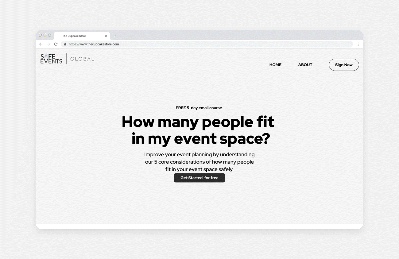
Analyzing the existing landing page, I identified several issues:
No clear visual or content hierarchy
Lack of focal points and negative space
Repetitive and overly complex copy
Visual style that failed to convey trust or professionalism
These problems made the course feel harder to understand—and less credible—than it actually is.
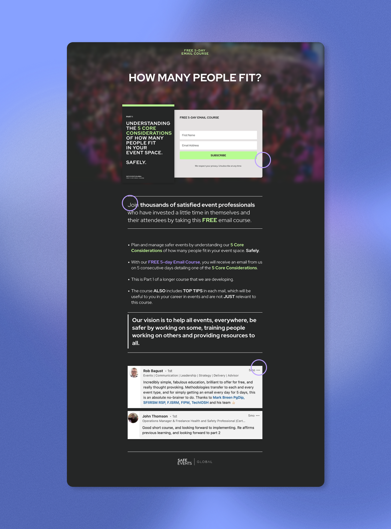
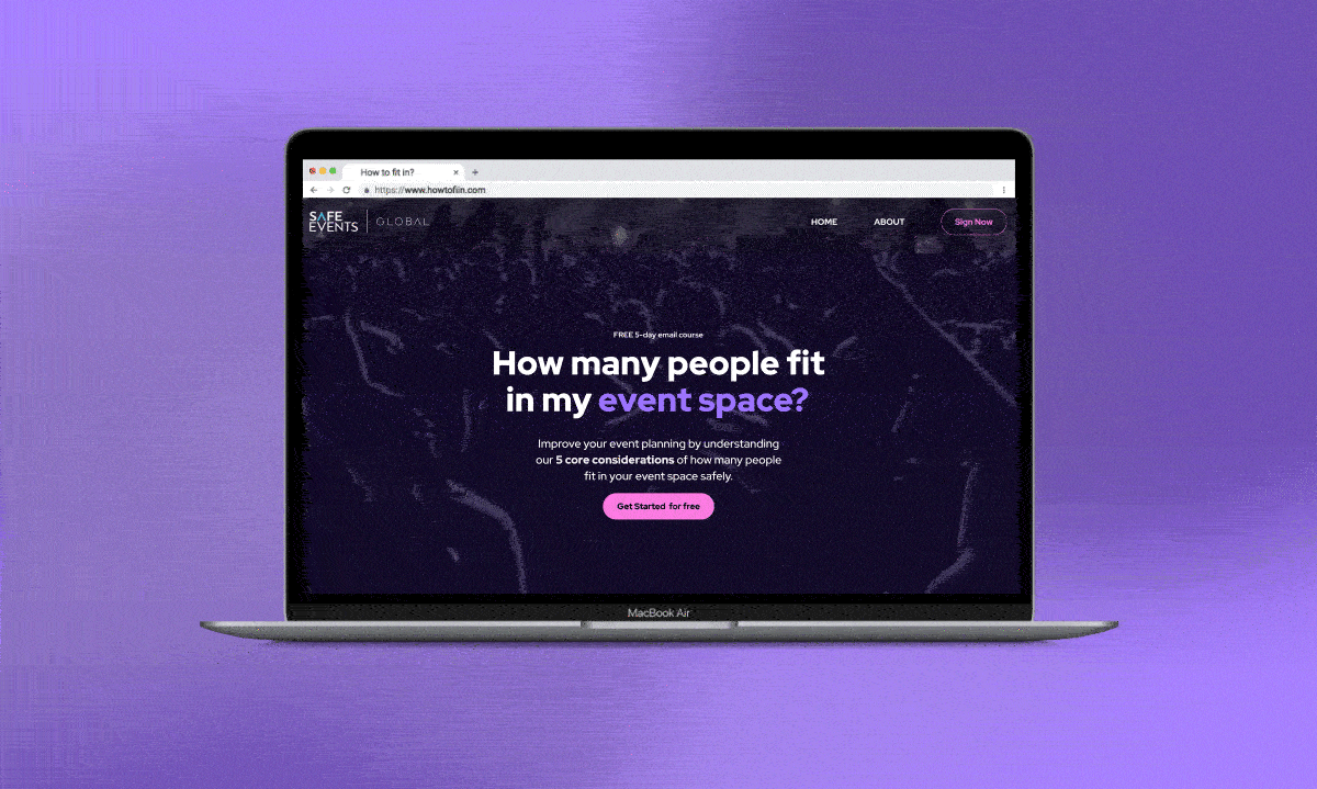
My solution focused on presenting information clearly, building credibility, and encouraging action:
Content restructuring:
Developed a persuasive storytelling flow: a catchy title, brief introduction, and chunked content with ample negative space.
Highlighted key course topics for clarity.
Social proof:
Showcased experts who have completed the course.
Added testimonials to validate the course’s quality.
Call to action:
Ended with an inspiring paragraph and a strong sign-up prompt.
The goal was a modern, casual design that still maintained trustworthiness, appealing to a tech-savvy, busy audience like Laura.
Ideation & Wireframes
Visual Design & Prototyping
UI decisions
Followed the existing style guide to ensure brand consistency.
Used pink to create energy and attract attention, paired with neon purple for balance and sophistication.
Applied lowercase typography to create a more friendly and contemporary tone.
Established hierarchy through font size and weight.
Kept visual elements minimal to support readability and navigation.
Used photography to bring warmth and a more human feel to the page.
Mobile
The mobile version maintains the same visual identity, with adjustments to layout and imagery to ensure clarity and usability on smaller screens.
Reflections
This project was developed under tight time constraints and without primary user research. While that limited deeper validation, it closely reflected real-world scenarios where designers must make informed decisions quickly. Despite the constraints, this challenge reinforced the value of a user-centered mindset and allowed me to apply and strengthen my skills in research, structure, and visual decision-making.